
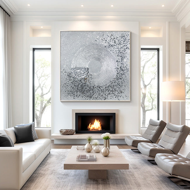
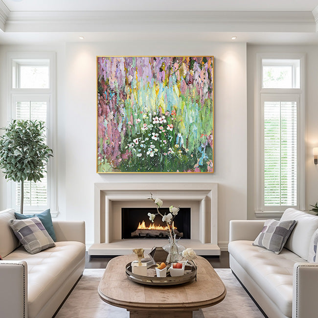

How to Match Wall Art With Your Interior Color Palette
(A Complete Guide to Creating a Cohesive, Designer-Look Home)
Choosing wall art is not just about filling empty space—it is about creating visual harmony between artwork and your interior color palette. When done correctly, wall art can elevate your home from “decorated” to “designed.”
Interior designers from institutions such as the American Society of Interior Designers (ASID) emphasize that color cohesion is one of the most important principles in spatial design, directly affecting how balanced and intentional a room feels.
In this guide, you’ll learn exactly how to match wall art with your interior color palette like a professional designer.

1. Start With Your Existing Color Palette
Before choosing wall art, identify your dominant interior colors:
· Wall color (base tone)
· Furniture (sofa, table, cabinets)
· Accent tones (pillows, rugs, decor objects)
According to Behr Paint’s Color Trends research, successful interior styling often follows the 60-30-10 rule:
· 60% dominant color
· 30% secondary color
· 10% accent color
Wall art typically belongs in the accent layer, meaning it should either reinforce or elegantly contrast your existing palette.

2. Choose Between Harmony or Contrast
There are two professional approaches used by interior designers:
✔ Harmonious Matching (Safe & Elegant)
Use wall art that shares tones already present in your room.
Best for:
· Minimalist interiors
· Scandinavian style homes
· Neutral color schemes
Example:
Beige + warm gray interior → abstract art in cream, taupe, soft brown
✔ Contrast Matching (Bold & Designer Look)
Use complementary or opposing colors to create a focal point.
This technique is widely used in modern interior design as highlighted by Elle Decor.
Example:
· Neutral room → black, gold, or deep navy artwork
· Warm interior → cool-toned abstract art

3. Follow the “Tone Temperature Rule”
Interior designers often classify colors into:
· Warm tones (beige, gold, terracotta)
· Cool tones (gray, blue, black)
· Neutral tones (white, cream, taupe)
To create balance:
· Warm interiors → choose warm or neutral-toned art
· Cool interiors → choose grayscale or monochrome art
· Mixed interiors → use neutral abstract artwork
According to Pantone Color Institute, maintaining temperature consistency is key to visual comfort in interior environments.
4. Match Texture, Not Just Color
A common mistake is focusing only on color.
However, luxury interiors rely heavily on texture layering, including:
· Impasto painting
· Mixed media artwork
· Canvas depth and framing style
Design experts at Architectural Digest highlight that textured wall art adds “visual depth and tactile richness,” especially in neutral spaces.
A cream-and-gray room pairs beautifully with:
· Thick impasto abstract art
· Gold leaf detailing
· Plaster-textured canvas

5. Use Art as a Focal Point Strategy
Wall art should either:
· Anchor a room (main focal point)
· Balance a space (secondary visual support)
For example:
· Large sofa wall → oversized diptych artwork
· Bedroom → soft, calming abstract piece
· Entryway → bold statement artwork
Interior design studies from The Interior Design Institute (IDI) show that focal wall styling increases perceived spatial organization and luxury perception.
6. Frame Style Matters More Than You Think
Framing is part of your color palette system.
Common professional choices:
· Black floating frame → modern + high contrast
· Natural wood frame → warm + organic
· Frameless canvas → minimal + gallery style
A black floating frame is especially effective in modern interiors because it creates visual separation and enhances contrast without overwhelming the palette.

7. How to Apply This to Real Homes (Example)
Let’s take a real-world palette:
· Cream walls
· Warm gray sofa
· Black accents
· Subtle gold elements
Best wall art choice:
· Abstract impasto artwork
· Cream + charcoal + gold palette
· Black floating frame
· Vertical or diptych composition
This combination creates:
✔ Balance
✔ Depth
✔ Luxury feel
✔ Visual continuity
8. Final Thoughts
Matching wall art with your interior color palette is not about guessing—it is about following design principles used by professionals.
To summarize:
· Start with your base palette
· Decide harmony vs contrast
· Match tone temperature
· Consider texture and materials
· Use framing as part of the design system
When done correctly, wall art becomes more than decoration—it becomes the defining element of your interior identity.

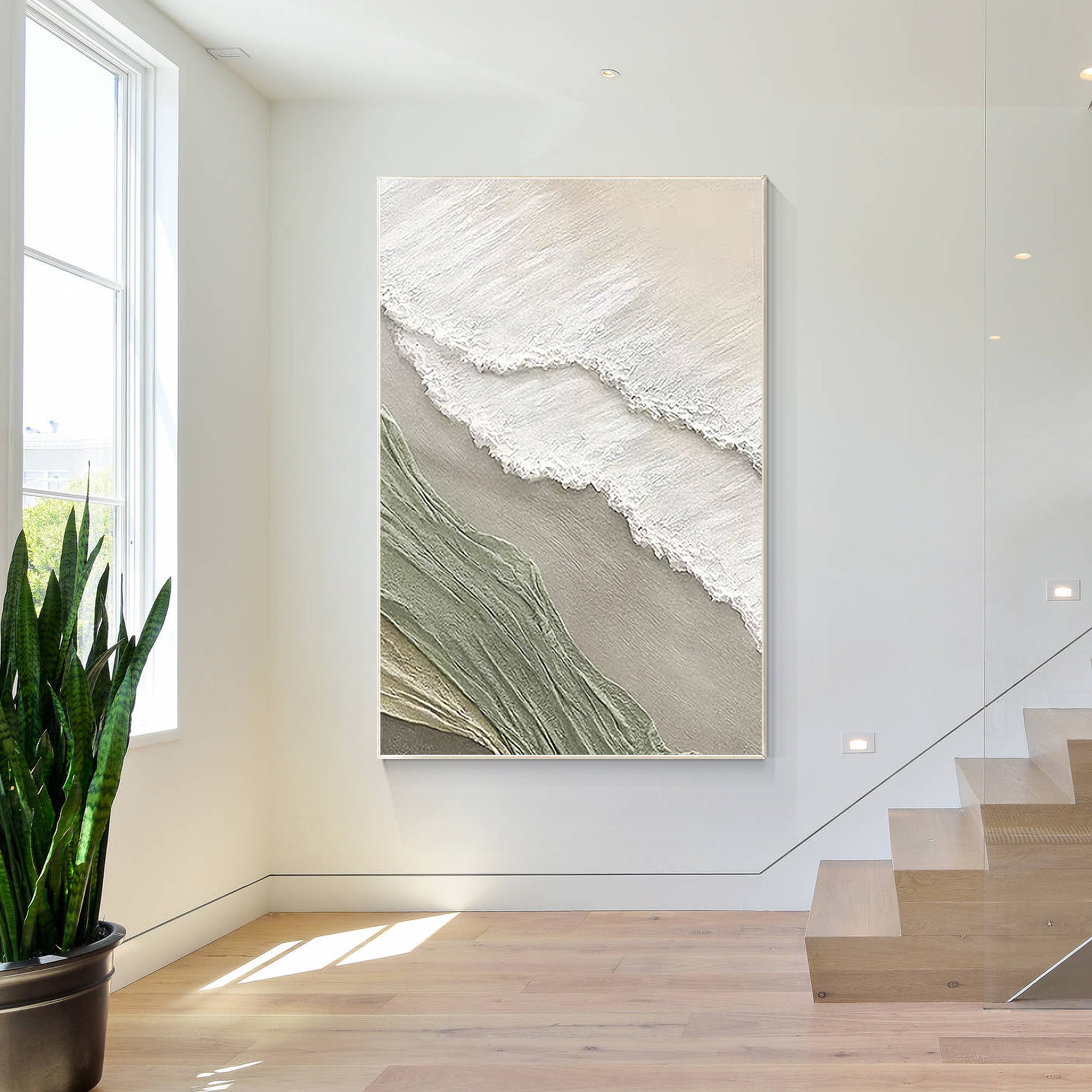
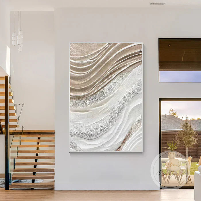
%0AChoosing%20wall%20art%20is%20not%20just%20about%20filling%20empty%20space%E2%80%94it%20is%20about%20creating%20visual%20harmony%20between%20artwork%20and%20your%20interior%20color%20pal...)