
How to Choose Wall Art That Matches Your Home Decor Style
✔ Quick Answer
The easiest way to match wall art is:
- Identify your home decor style
- Follow the color logic of that style
- Choose art that complements texture, mood, and scale
According to The Spruce:
https://www.thespruce.com/what-is-interior-design-4684013
A well-designed space uses consistent elements such as color, texture, and style to create a cohesive look.
1. Modern Style: Clean, Structured, and Balanced
✔ Style Features
- Neutral tones (black, white, gray)
- Clean lines and geometric shapes
- Open and uncluttered spaces
✔ Color Logic
Modern interiors rely on monochrome palettes or subtle contrast.
According to Interaction Design Foundation:
https://www.interaction-design.org/literature/article/principles-of-design-visual-hierarchy
Visual harmony and consistent color structure improve how we perceive space.
👉 This means your wall art should blend or softly contrast, not overpower.
✔ Recommended Wall Art


These abstract pieces use neutral layering and soft transitions, making them ideal for modern interiors.
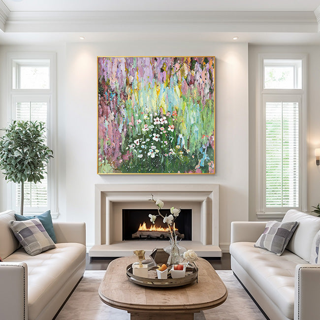
2. Boho Style: Warm, Natural, and Relaxed
✔ Style Features
- Earth tones (terracotta, beige, olive)
- Organic textures (wood, linen)
- Free-spirited, layered look
✔ Color Logic
Boho style uses warm, nature-inspired palettes with low contrast.
According to Verywell Mind:
https://www.verywellmind.com/color-psychology-2795824
Colors can influence mood and emotional responses.
👉 Warm tones in wall art help create a relaxed and inviting atmosphere, which is essential for boho interiors.
✔ Recommended Wall Art


These coastal-inspired artworks bring softness and natural energy into the space.
3. Minimalist Style: Simplicity with Purpose
✔ Style Features
- Limited color palette
- Clean composition
- Focus on space and form
✔ Color Logic
Minimalist interiors follow the rule: less color, more intention (usually 2–3 colors).
According to Stanford University design principles:
https://web.stanford.edu/class/archive/cs/cs147/cs147.1128/lecture/02/Slides02.pdf
Reducing unnecessary elements improves clarity and usability.
👉 In wall art, this means:
- Avoid busy compositions
- Focus on negative space and subtle detail
✔ Recommended Wall Art


A single, simple piece often works better than multiple artworks.
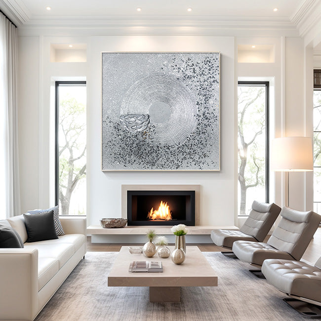
4. Luxury Style: Bold, Textured, and Statement-Driven
✔ Style Features
- Metallic accents (gold, silver)
- Rich textures (glass, layered paint)
- High contrast and visual impact
✔ Color Logic
Luxury design uses contrast + reflective materials.
According to Architectural Digest:
https://www.architecturaldigest.com/story/luxury-interior-design
Luxury interiors emphasize rich materials, textures, and statement pieces.
👉 Your wall art should stand out as a focal point, not blend in.
✔ Recommended Wall Art


These textured and reflective artworks create depth and elevate the overall space.
🎨 Different Styles, Different Color Matching Logic
Here’s a simplified breakdown:
| Style | Color Strategy | Visual Effect |
|---|---|---|
| Modern | Neutral + soft contrast | Clean and balanced |
| Boho | Warm + earthy tones | Relaxed and natural |
| Minimalist | Limited palette (2–3 colors) | Calm and focused |
| Luxury | High contrast + shine | Bold and dramatic |
👉 According to Nielsen Norman Group:
https://www.nngroup.com/articles/visual-hierarchy/
Scale and contrast guide attention and perception.
This is why color contrast in wall art directly affects how a room feels.
⚡ One-Click Matching Guide (High Conversion Section)
Use this simple system:
Step 1 — Identify your room style
Modern / Boho / Minimalist / Luxury
Step 2 — Match color tone
- Neutral → Modern / Minimalist
- Warm → Boho
- High contrast → Luxury
Step 3 — Choose artwork scale
- Large wall → 1 statement piece
- Small wall → 1–3 smaller pieces
Step 4 — Decide visual role
- Need focus → bold textured art
- Need balance → subtle neutral art
🧠 Why Matching Wall Art Matters
Wall art is not just decoration—it defines how a space is experienced.
According to Tate (UK art institution):
https://www.tate.org.uk/art/art-terms/a/aesthetic
Art plays a central role in shaping the aesthetic experience.
👉 In home decor, wall art acts as a visual anchor, tying together furniture, colors, and mood.
🛍 Final Tip: Shop by Style for Easy Matching
Instead of guessing, choose wall art based on your decor style:
- Modern → Abstract neutral art
- Boho → Nature & coastal art
- Minimalist → Simple, clean designs
- Luxury → Textured, metallic pieces
Explore more here:
https://ymipainting.com/
✅ Final Takeaway
Matching wall art is simple when you follow three rules:
- Match the style
- Match the color palette
- Match the mood
Once these align, your space will instantly feel more cohesive and professionally designed.
❓ Frequently Asked Questions About Matching Wall Art
1. How do I match wall art with my home decor style?
To match wall art with your home decor style, identify your interior style first, then choose artwork that aligns with your color palette, materials, and overall mood. Consistency in design elements helps create a cohesive space.
2. Should wall art match furniture or wall color?
Wall art should complement both, but it doesn’t need to match exactly. It can either:
- Blend with the wall color for a subtle look
- Contrast with furniture to create a focal point
According to The Spruce:
https://www.thespruce.com/what-is-interior-design-4684013
3. What size wall art should I choose?
Wall art should be proportional to your furniture:
- Above sofa → 60–75% of sofa width
- Large empty wall → one oversized piece or gallery set
According to Nielsen Norman Group:
https://www.nngroup.com/articles/visual-hierarchy/
4. What type of wall art works best for modern interiors?
Modern interiors work best with:
- Abstract art
- Neutral color palettes
- Geometric compositions
These elements maintain simplicity while adding visual interest.
5. How many colors should wall art have in a minimalist room?
Minimalist spaces typically use 2–3 colors max to maintain clarity and balance.
According to Stanford design principles:
https://web.stanford.edu/class/archive/cs/cs147/cs147.1128/lecture/02/Slides02.pdf
6. Can wall art change the mood of a room?
Yes. Color psychology shows that artwork can influence emotions and atmosphere.
According to Verywell Mind:
https://www.verywellmind.com/color-psychology-2795824
