
How to Choose Wall Art Colors That Match Your Interior Design
Choosing the right wall art is more than simply finding a beautiful painting. The colors, style, and placement of artwork can dramatically influence the atmosphere of a room and help create a balanced interior design. Whether you are decorating a modern living room, a cozy bedroom, or a stylish office, selecting artwork that complements your existing color palette is essential.
In this guide, we’ll explore how to choose wall art colors that match your interior design and create a harmonious, professional-looking space.

1. Understand Your Existing Interior Color Palette
Before choosing wall art, start by analyzing the colors already present in your room.
Professional interior designers often use the 60-30-10 color rule, a widely recognized design principle:
60% – Dominant color (walls, large furniture, flooring)
30% – Secondary color (chairs, curtains, rugs, decorative pieces)
10% – Accent color (artwork, accessories, small details)
Using artwork as the 10% accent color can add personality and visual interest without overwhelming the room.
This approach is commonly referenced in interior design education and is consistent with color harmony principles taught by organizations such as the National Kitchen & Bath Association (NKBA) and professional design programs.

2. Choose Artwork That Complements, Not Copies
A common mistake is choosing wall art that exactly matches the colors of your furniture or walls. While matching can work, it may make the room feel flat.
Instead, consider complementary colors.
For example:
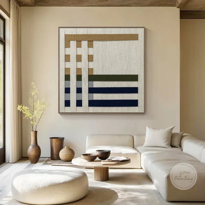
A neutral beige room can be enhanced with artwork featuring deep blue, green, or warm earth tones.
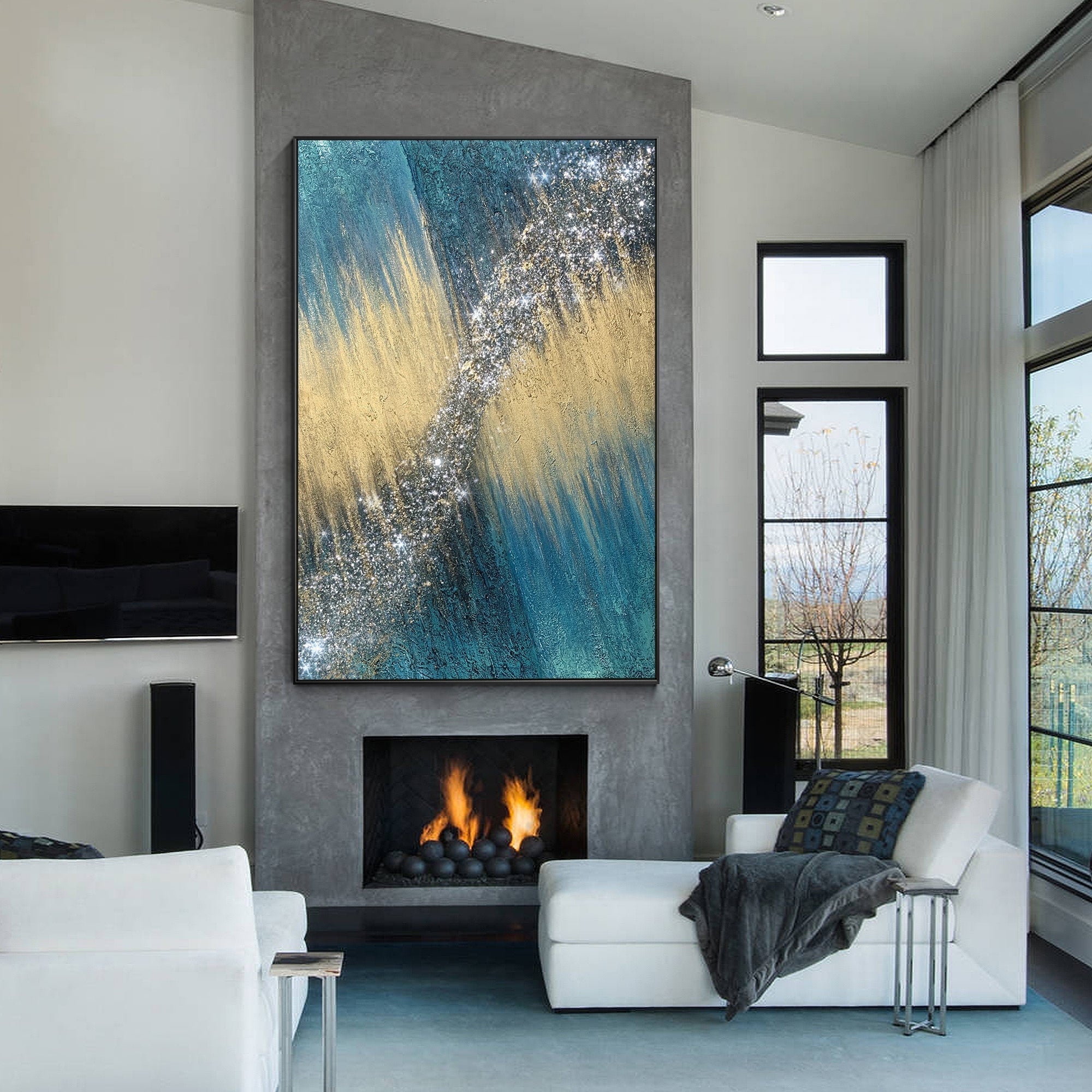
A modern gray interior can benefit from artwork with bold colors such as orange, red, or yellow.
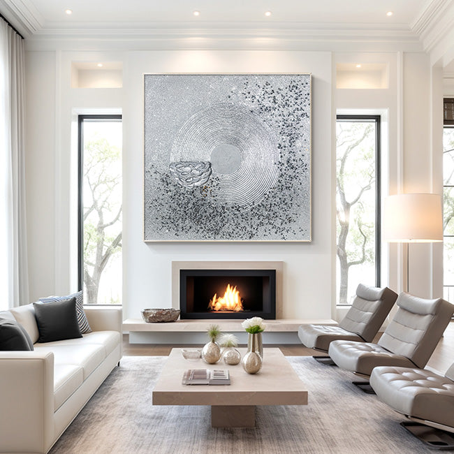
A minimalist white space can become more expressive with colorful abstract or pop art pieces.
The goal is to create connection between the artwork and the room while allowing the painting to stand out.

3. Consider the Mood You Want to Create
Colors influence how people experience a space. According to color psychology research, different colors can create different emotional impressions.
Blue Artwork
Creates a feeling of calmness, relaxation, and balance. Ideal for bedrooms, bathrooms, and peaceful spaces.
Green Artwork
Represents nature, freshness, and harmony. Works beautifully in living rooms and spaces with plants or natural materials.
Red and Orange Artwork
Adds energy, warmth, and excitement. Suitable for social areas such as dining rooms and entertainment spaces.
Black and White Artwork
Provides elegance, simplicity, and a timeless modern appearance.
When selecting wall art, think about the feeling you want your room to communicate.

4. Match Artwork Style With Your Interior Style
Color is important, but style matters too.
Modern Interior
Choose:
Abstract paintings
Minimalist artwork
Bold color combinations
Traditional Interior
Choose:
Landscape paintings
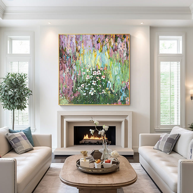
Classic floral artwork
Warm and natural tones
Scandinavian Interior
Choose:
Soft neutral colors
Simple compositions
Nature-inspired artwork
Eclectic Interior
Choose:
Vibrant colors
Unique statement pieces
Creative artwork combinations
A well-chosen painting should feel like a natural part of the room rather than an isolated decoration.

5. Use Artwork to Add Contrast
Interior designers often use contrast to create visual balance.
If your room has:
Light walls → consider darker or more colorful artwork
Dark furniture → consider brighter artwork
Simple decoration → choose a statement piece
Bold furniture → choose artwork with balanced colors
Contrast helps artwork become a focal point and adds depth to the room.
6. Pay Attention to Lighting
Lighting can significantly affect how artwork colors appear.
Natural daylight may make colors look brighter, while warm indoor lighting can enhance yellow, orange, and red tones.
Before making a final choice:
Observe the room at different times of the day
Consider the direction of natural light
Think about artificial lighting around the artwork
Professional museums and galleries carefully consider lighting because it affects how viewers perceive color and detail.

7. Create a Personal Connection
The most important rule when choosing wall art is selecting something that reflects your personality.
A painting should not only match your sofa or wall color—it should also tell a story and create an emotional connection.
Whether you prefer a peaceful landscape, a colorful pop art piece, or a modern abstract painting, the right artwork can transform your home into a more personal and inspiring space.
Expert Design Principles Behind Color Selection
The recommendations in this article are based on established interior design concepts including:
Color harmony principles developed through traditional color theory
The 60-30-10 interior design color guideline widely used by professional decorators
Environmental psychology research on how colors influence human perception and emotions
Professional interior design standards promoted by organizations such as the National Kitchen & Bath Association (NKBA)

Final Thoughts
Choosing wall art colors that match your interior design does not require strict rules. The best artwork creates balance, adds personality, and makes your space feel complete.
When you find a piece that connects with your style while complementing your home’s colors, it becomes more than decoration—it becomes part of your living experience.
Explore artwork that brings color, emotion, and character into your space, and let your walls tell your story.